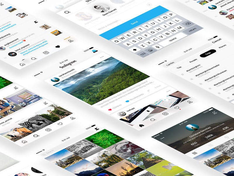
Design principles are a set of generally applicable laws, guidelines and design considerations. They reflect the knowledge and experience accumulated over the years by professionals and researchers in different fields.
These principles serve as a starting point for the creation and problem solving of our designs. Furthermore, they usually combine developments in different disciplines, not only related to design, but also to sociology, psychology, physics, ergonomics and human behavioural sciences.
Alignment
We mean placing text or any other design element in a format or page in an aligned manner. This helps us create a certain order, organize each of the elements, create visual connections and improve the overall readability of our design.
Aligning elements that are not close to each other helps us provide an invisible connection between them. This is why, if our design is well aligned, it will go unnoticed. Conversely, poor alignment will have the opposite effect, and will be noticed almost instantaneously.
This principle is shown in many ways. We can align both vertically and horizontally. Align with respect to one of the edges of our work table, or to the center of it. Or we can even use a broken alignment to highlight an element. That is, to have a completely aligned design, and that the element of value, or to which we want to give importance, is shown clearly outside that alignment.

Contrast
Contrast allows you to emphasize or highlight one or more key elements of your design. We create this contrast by showing two totally opposite elements. But not only with respect to their color.
Contrast has a basic role if our purpose is to organize the information on the page. At the same time we want to guide the reader to where we want him to look in the first place. It will serve to make our point of interest a focal point of our design. Therefore, it is best to leave out subtleties, and that the contrast shows in an obvious and striking way.
Blank space
The parts of the design we leave blank, or empty, are almost as important as the parts we fill in with color, images or text. This empty space between the rest of the elements is creating a shape, which will highlight the most important areas of the design.
This game with the blank space we can differentiate them in two big groups. On the one hand, there is the use of a large blank canvas with only one main element, which serves to focus on it. With this we obtain a minimalist and clean design, playing also with the contrast, of which we have just spoken. An example of this type of design is the Google search page. Clean, minimalist, and with just the right elements to avoid distractions.
Balance
Every element of the design has a visual weight. And by using this visual weight, we can create a balance in our composition. This is a very important part to take into account, since we, naturally and unconsciously, look for a balance, both in our lives and in everything around us.
Seeking this balance is an essential part of a good graphic or web designer’s job. If we can achieve this, we can direct the reader’s attention to where we want. In addition to correctly communicating the message we want to launch. Because at the end of the day, that is one of the purposes we want to achieve.
Hierarchy
The hierarchy must classify each element of the design according to its importance within it, creating a guide through which our eyes must move. Viewers or readers will initially fix their vision on the most dominant features of the design, gradually moving towards the secondary content, until they have examined all the information
This hierarchy is established in different ways: size, color, shape, orientation… This visual hierarchy is fundamental in any graphic design that has multiple elements. It serves to identify a logo, as well as to make navigation through a website as simple as possible.
Proximity
Proximity within graphic design serves us to, by grouping certain elements, make it obvious to the viewer that these elements are related. And the elements that are unrelated or different, we must space them out to emphasize their lack of relationship.
This is because human beings tend to organize elements into logical groups, as they serve to maintain a certain logic and order. And this principle is just a way of formalizing this innate order that we have. And that serves to communicate with others in a simpler way.
Repetition
If what we are looking for is to create a unified and cohesive design, the repetition of certain elements and/or characteristics will be our best ally. Especially when we are creating a brand or a series of images.
The patterns are nothing more than the repetition of several elements. These are quite common in web page or application backgrounds. They help us to make the background a whole, but not as boring as when we use a background with a flat color. If you want to know how to create a pattern, don’t miss our article on how to create patterns in Illustrator. I’m sure it will help you.
With all these principles in mind, it will be easier for you to tackle any design, whether we are talking about graphic design or web design. And we can make sure that they work and cause the effect we want in all those people who are going to consume it, or are going to use it.


