
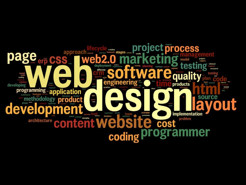
Web design is evolving over the years, seeing different trends that predominate when creating a website and that great brands put into practice, being pioneers of these fashions. Trends come and go, as do fashions, so we have to be constantly updating ourselves so we don’t become outdated with the design of our website. We don’t want that to happen this year, do we?
Even so, we are not fortune-tellers (at the moment), and knowing what will happen next year is not easy, but there are trends that are starting to stand out and that will surely be the talk of the town in the coming year. As a web design, I must tell you that you must not forget that your design must be unique and personal, and you must always be following the changes that occur in design trends.
Minimalist Trend
Spaces, white backgrounds, simple letters, limited colour palette, menus with fewer options. It is all about directing the user’s attention to the main element that draws attention above all the elements on the page. It is based on a trend of less is more, to make your readers fall in love with simple strategically placed elements, in which organization is the key.
Visitors are not looking for a site full of elements, banners and pop-ups that invade their screen and make them feel frustrated, they want websites that are clean, easy to access and easy to find what they are looking for. Another way to follow this trend in a more visual way is to use spaces with brightly colored backgrounds and that follow the psychology of color, this will capture the user’s attention in the element we want to highlight.
Colour Palette that breaks with a Vivid Colour and Gradients
The minimalist trend has always been based on white, black and grey colours, but isn’t it more visual to do it with colours that are groundbreaking and call to the user? It is necessary to attract the visitor with a combination of colors that call his attention, with striking calls to action that lead him to click.
Colours are used strategically to make the eyes go to them above the other elements – you have to know how to play with this! Even so, don’t overdo it with bright colours, using soft tones combined with some brighter colour is an option that never fails.
Hero, SVG and End of Slider images
When we talk about hero images, we are talking about full screen or fullscreen images on the home page. They are very visual, and although in the past users did not scroll and did not keep reading all the content of the page.
This kind of images transmit organization, freshness and cleanliness to the web page. They make the user see directly the main element to be highlighted against the rest of the content, besides the size does not go unnoticed. The SVG extension has been among the most outstanding and popular for some time now due to its easy scalability and the fact that it does not lose quality, so it will continue on fire this coming year for our graphic elements.
Large fonts
Another trend to take into account when designing a website is typography. Flashy, big letters that stand out from other elements are gaining a lot of weight, as they help to enhance the message you want to convey and create a visual interest.
Moreover, clean and simple texts, with striking web typographies, combined with a hero image, give way to a very creative and visual design, based on an image and a text, which directly communicate the message. In Google Fonts you can see all the fonts that are usually used to create web pages and you can also download them for free.
Ghost buttons
Sounds weird, doesn’t it? Ghost buttons have a minimalist touch. They are buttons with a basic design, but at the same time adapted to these times when people are looking for simplicity and professionalism, but with a special touch. Its transparent content makes the image not to go unnoticed and gets special prominence in front of the button, being very elegant in our content.
Videos
Has anyone ever told you that the future is in videos? Well, it is! We’ve been watching them for several years now, but the reality is that they are becoming more and more powerful, and this trend is going to increase. The videos are interesting for the users who enter the website, and if we manage to capture their attention with the video, it will increase their time on the site.
GIFs or Cinemagraphs
It is true that we do not stop seeing GIFs everywhere, on Facebook, Twitter, Instagram. But it is a trend that should not be ignored, as they are very colorful and draw attention in every way possible.
But what is really coming up is the use of cinemagraphs. A cinemagraph is a fusion of an image with a video, which provides a striking and curious visual effect for the user, creating a kind of dynamic image with a lot of magic.
Icons and lines
The vast majority of websites use icons to visually explain what they offer. Icons add personality to the texts of the content we want to explain, and they provide distinction. Moreover, if we include a slight movement in them, you will win the user over right away!
No more Free Unedited Images
Companies have abused free and royalty-free image banks, even taking images from the Internet that other sites in their sector use. Why not hire a professional to make some original images according to our website? The best web designs take great care of your image and give great importance to graphic design.
Movements and Animations
Light movements in our photographs with parallax (movement at different speeds that occurs when scrolling on our website) or “fade in” effects (movements of the elements entering) are at the latest in web design. It is increasingly common to see scrolling animations and animated logos, and they are everywhere!
Mobile Version
This is nothing new, it is something that we have seen in recent years, and that we are increasingly taking into account, but even so, I think it is important to highlight. You can see more and more sites with responsive or adaptive web designs, which makes the web accessible from any platform. That is why all web design techniques must be taken into account for mobile format and thus provide the user with a better experience.
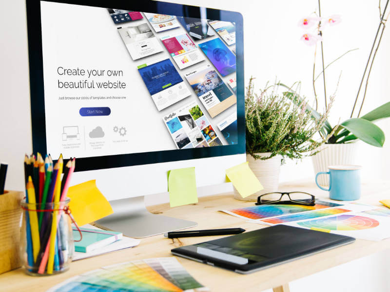
Simplicity, Less is More
Throughout these years we have seen websites where we were approached with banners, pop-ups, sidebars, very flashy buttons, live chat, etc. These could make the user or client run away. Today we have to focus more on capturing the attention through what really matters, the content of the website, the basic and essential that every website needs.
Web trends come and go, but if we manage to combine a nice web design, with a good graphic design and a fast loading speed, who will resist us? The trends are very nice, yes, we all agree, but I’ll summarize a couple of tips that I would take into account to make my website and not abuse them.